
By Bob Glaser, UX Architect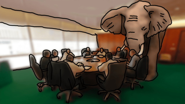
One of the great inefficiencies in UX design comes from the various forms of lack of honesty. This happens in both individual design and collaborative design. I chose that wording because dishonesty implies intent while “lack of honesty” includes neglect, cognitive biases, etc that along with intent. While empathy with the user is an essential component. Rigorous and sometimes brutal honesty is essential to good UX design.
If you can accept kudos for successes, then you must accept blame for failures. Failures generally teach us more than successes. “Best” is a comparative term with no indication on the scale of total failure (0 if you will) and perfection (~ infinity if you will) based only on what currently exists. Even then, only if all previous incarnations of a concept rate at. for example, 5 and you’ve met the 10 mark then you have improved the concept by 100%, but, you have no way of knowing if perfection is 15 or 150000). This allows us to easily stagnate on the laurels of success.
Failures, however, are concrete or finite. Through rigorous honesty, we can and always should find the root causes. There’s almost always more than one cause, so you shouldn’t stop failure investigation once one answer is determined. Here is a good place to implement the “5 whys approach” as a start. The five why’s are well described in many Lean processes so I’ll not repeat them here.
It’s perfectly acceptable to make myself unpopular in meetings when, after presenting a solution to a user’s problem as being successful in user testing, hearing an internal (within the company*) comment of “I don’t like it.”, “It’s ugly.”, “It’s too plain.”, “It’s not exciting.”, etc., the response ought to be “Thank you for your opinion but it is not relevant here. You are not the user and neither am I.” The aggregated feedback from user testing is factual. I am quite aware that both formative and summative user testing may, by the necessity of the product design and use, require user opinion but this opinion is part of the aggregate scoring and should be both consistent in its testing application, non-leading in it’s style, and evenly distributed for accurate representation in the aggregate totals. The comments made are always taken into account though, because they may point out an area of potential improvement. Here is where we appropriately balance the objective results with the subjective impressions.
Another place where honesty is needed, is in the “big picture” integration of many features in a complex system. An example may be an enterprise system with a primary user group, secondary user group and tertiary user groups, (and so on) each with varying needs and perhaps UIs from the same system. Often, particularly in Agile development environments, individual features are addressed in an unintended silo approach that places “common expectation” or “intuitiveness of a single feature/function” over a common UX design in both integration and unification. This approach averages rather than optimizes the UX and UI. This is the enterprise system product that has multiple functions and multiple types of users mentioned above where hierarchy of users may not correlate to an expected hierarchy in user numbers (e.g. the mistaken primary user focus may only be 10% of the total user base.) This is not the fault of Agile method but it the Agile process allows this to be easily ignored or glossed over. (We must remember that the Agile process was developed as a software development process, without UX as part of its initial design and there are many good articles out there on methods for the incorporation of UX into the Agile process.) This may seem counter-intuitive to design, but what it does is; help to reinforce a common mental model of a complex system.
Next is honesty in priority of function. I have often experienced great effort (and financially disproportionate) in infrequently used or needed features. I think of this as the “pet project syndrome”. Another cause of this is insufficiency or even failure to clearly define the priorities with weights (based on user needs) of features in a form that is rigid enough to create a reasonable goal. The deficit in this area of honesty deprivation is the lack of focus on the primary functionality. This is also one of my favorite areas where the “bucket of rationalizations” is brought out to justify poor decisions in the design process. Here is fertile ground for false dichotomies, and false equivalencies. Often fast decision making masks these mistakes and makes them difficult to see until it’s too late. This is often a result of numerous directional changes within the development cycles and heuristic iterative processes prior to user testing.
Another area is democracy in design. This is a practice that I feel should be abolished after the first heuristic phase of formative evaluation. Then the only time this kind of voting should be applied is with a group of well targeted users who have just tested the product or prototype. Votes taken in a board room are not only of little value, they can be counterproductive and costly. Even in heuristic evaluations, these can be problematic since equal weight is given to a UX designer, feature creator, feature implementer/developer(s), system architect, technical product owner and marketing product owner. Each of these people have an agenda that may be rationalized as user-centric when underneath there may be other reasons (conscious or unconscious). I include the UX designer as also being potentially influenced here. Basically it comes down to the simple fact that the further you get from the user, the more likely you are to get decisions based on non-user relevant concepts. It is easy to fall into the trap that “these decisions affect the user in the long run” is a rationalization for business cut backs based on time or resources and the true effect that it has on the user may be irrelevant or even counter productive. It is not to say that these decisions are to be dismissed, as they may have significant business relevance, but UX should not be included in this unless there is a measurable and direct 1:1 relationship.
Any good designer knows that it is not their “great taste and discernment” that makes them a great designer but rather the ability to create something that they may find personally “ugly in concept or aesthetic or even at the cognitive level” but realize that it is ideal for the end user. If you want to create art, then become an artist where your ego is an asset rather than a liability
Another is the top 3, 5, 10 lists. This not only smacks of amateurism but also ignores the fact that the number is irrelevant when it comes to any MVP (minimum viable product). The features list for an MVP should be only changed when a serious deficit or redundancy is discovered. Not based on anyone’s personal whims (though these whims are typically presented as essential and often with circular logic or specious arguments or examples that are not properly weighted.) I have personally turned down offers to write articles base on these “top ten things…” since any good professional will know them already. They are useful for the beginner but have the dangerous flaw of being viewed as intractable rules.
To me, my best work is invisible. My favorite analogy for this is the phone. When the user wants to call their mother, their goal is to be speaking to their mother. Not a fun dialing experience, not a beautiful ‘dial/send/connect button. Just to talk to their mother. So the practical and physical tasks needed to accomplish this should be seamless and so intuitive and obvious that the user may not even be aware that they are doing it. The challenge her is in getting the user used to doing something that is new to them, different, or requiring trust that a common use case addresses with one or more extra steps. A common example of this is the elimination of the “save” function in Apples iOS. there were plenty of people who didn’t trust it or would constantly check for it until they trusted that their input was saved automatically. The caveat being the “Save As” function.
I should point out here that while I’m a believer that facts rule over opinion most of the time, I will always concede to the fact that our end users are human. There is much more than logic and statistics involved here. Culture, education levels/intellect, common mental models of the user base, and other psychological factors have an important place in UX design as well as limitations that may be set by safety, regulatory, or even budget. The important thing is to make sure that honesty is not pushed to the sidelines because of these additional variables but rather it is viewed as an important way of also dealing with them.
* these examples are based on my experiences at over 13 companies (every company I’ve ever worked for so it isn’t an indictment of any one company but rather a common systemic problem.) as well as examples given directly to me by many other great designers like Don Norman and others.
