Real vs. realistic: The subtle but important problems of generative AI systems.

by Bob Glaser, UX Architect, Strategist, Voice and AI Interaction Design

“This was from an earlier version of Dall-E. The prompt was: “a doll with a sad face at a carnival.” At this point March 2023, faces and hands were particularly problematic. Now, while they are much better, the details still tend to have anomalies, even with extensive prompt engineering.

I used to do some work in 3D modeling and rendering. How realistic something needed to be was highly dependant on the amount of detail in the model. But it also depended on the amount of effort in terms of complex detail or and surfacing as well as control and power was available for rendering (depending on how physically accurate the light needed to be). How the image would be viewed and and how long it might be viewed by the person or group that requested it mattered as well. It becomes very much an 80/20 result when it came to setting or addressing reasonable deadlines. Very often it was only the main object (usually a product) that was the primary focus. There may be multiple objects in a hierarchy of precedence or grouping. There might be other times when details in the background and in the shadows were critical to the viewer.

When generative AI is used to create elements it first need to utilize millions of examples of ingested data of what it perceives to the same elements required to match the requested prompt. It does this roughly through algorithms and other programming process using the data that it has been provided. The more data that is provided, the more realistic the result. None of this based on any context or understanding of the real world. The quality of the output was dependent on the quality and quantity (including aspects of variety) of the input. This is why, for example earlier versions of stable diffusion models produced often weird or distorted hands or face, especially the eyes. They didn’t become better by understanding how a hand is constructed or function nor did it understand eye structure within a cranium. What it did was learn represent them more realistically by using more ingested data and improved algorithms.

Until AI is based on factual data and not merely on the most data it will never really be able to correctly answer based on an understanding of the question rather than creating the most acceptable result. The best LLMs, stable diffusion models and other similarly trained systems are most effective because they are based on the largest data sets available. There are several problems with this that must always be remembered.

  1. The natural language approach means that the answers or explanations given are not based on all available facts but rather all available data. Usually the internet is the primary source. This results in responses that are based on sounding as realistic as possible. This also presumes that most information is going to be accurate. It may very well be but if the system has for example, a 96% accuracy rating and you don’t actually know the answer, you are unlikely to be able to discern that if answer is 4% incorrect or that 4% could be a critical part of the answer.

    There are fixes (filters, algorithms and other processes) that are often specific to individual models because filtering systems are build to address these fixes. The weakness of this solution is that those built in corrections or governors address problems only after they have been flagged. They are adjusting the results to be more correct but may not be correcting how the solution is determined. This means that the only real solution is to provide only validated factual data for the model to be trained with. Most of these approaches correct many problems but unfortunately, instead of correcting the problem, they can simply make it more difficult to recognize. The smaller these errors are doesn’t make them less dangerous, it makes them harder to find. Many will remember when they were in school and given a test. Often you see that merely stating the answer was not sufficient – you must show your work. Most generative AI systems I know aren’t truly able to show their work, because of the manner in which they execute a prompt.

    Most system issues are exposed when someone requests (prompts) the system on something that is already known by the requestor. The problem is exacerbated because it is based on the fact that most users aren’t going to ask questions that they already know the answer to. Why would they waste their time on something both futile and unproductive.

    People that are writing prompts know that in order to get something close to what they want requires context. However, what we think we provide as context in our minds has far more details, and often important details, that we often presume when we speak to another person. The details that are provided are prioritized by the system though we might think that the priority is obvious, it isn’t compared to how the AI model is going to interpret it.

    Even when you talk face-to-face, in person with someone, while each of you may have their own perspective, there are myriad conditions which both people can assume. These things include all environmental aspects like light and temperature and what other objects and people are around them and their relative positions and situations and expectations. There may also be contexts such as what the emotional effects of these environmental conditions are. For example it could be two people alone in a doctors waiting room, or alone in the forest, or in a crowd on the street or next to each other at a concert. There generally is no need in conversation to point out all of these elements. They are assumed since both people are in relatively the same environment, and it’s inferred context.
  2. The systems were designed using high end and powerful technology with allows is to ingest huge amounts of data with which to build the model. It is this speed that makes current AI models like LLMs available to a wide range of people and to do it so easily. It is also the mass of unfiltered data that makes their output seem far more amazing than it is. This, unfortunately allows the systems to be mindless con-artists.

    The way systems approach and correct problems has already been well reported on. While the designers of the systems can tell you how an particular request is is processed, they also have pointed out something that is fairly alarming: That is that they can accurately describe how a problem is handled but they can tell you exactly what went into the solution of any specific problem. In certain aspects these are “black boxes” where the input goes in one place and a result comes out the other end.
  3. While there is much discussion on the ethical use of generative AI systems, the part that seems frightening absent is in addressing it from the standpoint of ethical design and development. There are many positions now in business that focus specifically on the ethical use of AI. This is not surprising since it’s general release has found a population who see it as way to exploit people. Any service that’s so ubiquitous would end up being weaponized even if the creators never envisioned it. In 1942, Isaac Asimov first published the three laws of robotics.
  • robot may not injure a human being or, through inaction, allow a human being to come to harm
  • a robot must obey the orders given it by human beings except where such orders would conflict with the First Law
  • a robot must protect its own existence as long as such protection does not conflict with the First or Second Law. (he later added the 4th law)
  • a robot may not harm humanity, or, by inaction, allow humanity to come to harm.

These laws are very well known and, while dated, they still lay the groundwork for designing AI systems to be safe and not to simply assume that they will be used safely, of used with malice or criminal intent. We also have to look at AI more broadly than as simply a utilitarian tool. We must also look at AI working to AGI or strong AI or human-level AI. We have done far more and been more successful at imitating human output than we have replicating the human thought process. Even the label of “real” vs  realistic (or fake) changes with the context with which it is applied.

Consider how social media and the internet were intended to provide information and connection (relatively) freely to all. I don’t think any of the designers had this inconsideration when they were being built. This is not to even imply that they are bad ideas, but rather that designing anything for only altruistic reasons without the though that it could also be a manipulative corrupting power is naive at best. Simply dismissing any potential problem with “No one is going to do that!” is at the minimum of being thoughtless and at its worst, dangerous.

I know that there are AI designers and developers out there who are considering this, it just seems to me to be far fewer than the number we need. I have for some time been trying myself to work out a flexible methodology to build both ethics and safety into a system, and I’ve been working at it for a while. It’s easy to come up with theories but quite a challenge to design a pragmatic method to build and incorporate into systems in a methodical way which can be tested. Each new aspect to the solution brings a new challenge to address.

Posted in Uncategorized | Tagged , , , , , , , , , , | Leave a comment

Award winning UX is good for the ego but may have little financial ROI.

by Bob Glaser, designing user experiences since before they were called user experiences.

When I first started out as a designer, there was a tremendous effort in time and resource that was focused on having designs that are award winning. It was considered a real accomplishment that your work was scrutinized, filtered, and designated as “the best” by a panel of presumably distinguished judges. Businesses frequently placed high value on these accolades. Those that won the awards were often rewarded for their efforts in design. Now when you separate consumer products where the focus of the product is to entertain, to provide aspirational validation, or specifically achieve an artistic acceptance, then these awards are often quite useful as they provide guidance to the purchaser.

Earlier in my career these awards were great for the ego and contained bragging rights in the right circles. Over the years I learned, particularly in business products, that there is a problem with this. The success from a profit standpoint was often made that the product’s success was due to the award. Sometimes this would be true but but less often than you might think as there are many highly successful products that never won awards as there were many award winning products that were not successful in the marketplace.

In the realm of UX, this view of the greater successes of those unawarded products is ignored or dismissed. Even more problematic is that the products that won the awards were unsuccessful because of users/customers either not understanding or not smart enough or not aesthetically educated enough for the design. This places the aesthetics of product design above the effectiveness of a product. Often, way above it.

Educating a user should never be the primary intent of UX design. The exception is when the user’s primary goal is to be educated. When they want to learn. This is often when I become annoyed by the dictum “delight the user”. Most successful business products involve no direct delight at all in their use. In businesses and professions, what tends to delight the users of products is accomplishing a task, NOT the task itself. I’ve never heard anyone who had to fill in a spreadsheet in Excel say “Ooo, I can’t wait to open and use Excel.” They do, however have an indirect, however strong it may be, appreciation that using Excel as a tool provides a faster and/or easier way to accomplish the task. There is always the possibility of delight in discovering a better or faster way to accomplish a necessary task, but that delight disappears quickly as regular use of the product becomes second nature. It is a useful tool that provides more relief from a difficult task than joy in its use. This is not diminishing the value or acceptance or need of the product but rather a realistic view of its place in the users’ tools of productivity. Business productivity tools are generally viewed by regular users as a necessary evil.

Years ago when I was tasked with designing a digital phone keypad, I was literally told the this keypad must “delight the customer” (not the first time I’d heard that.) I said that when a user’s intent is to speak to someone, for example a good friend, the delight that they are seeking is in that conversation, not in the tasks necessary to achieve it. Fortunately, I had user data from testing as well as customer feedback to support my response.

So I started to notice that many awards were far more weighted on aesthetics than in user satisfaction. So when designing products, it needs to be determined if product success is more important than awards. Which is more important, winning awards or making the company more profitable. These are not mutually exclusive by any means. However, it is far easier, faster and more effective to design interactions and task flows and test them without fine aesthetic details than it is to include the aesthetics at the beginning. An easy approach to this would be to ensure that wire frames are devoid of any unnecessary color. There are many times when color is used because it is incorrectly determined to be necessary when in fact a word can be used. Including aesthetic elements early in the design also add time and effort and they can cause problems later. For example, if colors are designed in to represent feedback of levels and then later the number of levels changes due to either user feedback or product capability, then the design alteration that needs to be done can become exponentially larger in time an effort. This is because there may be a cascade effect on the use of the colors in other areas of the product.

When a product’s task flow has been thoroughly researched and documented and the interactions appropriately designed then the aesthetics can begin to be addressed. Additionally, addressing the visual aesthetics (or other aesthetics) at this point is easier since there is an essentially complete map of hierarchy to which the design is beholden.

An associated issue is who is judging these products. Less often than not, the panelists are chosen because their public stature is well known and not from an ability to judge objectively. They pass judgement because they desire the prestige of the judge’s position rather than having an ability to objectively review and select. Granted that no judging position is likely to be completely objective and unbiased, but a genuinely good judge will be able to chose something that they don’t personally like because it is factually and measurably better. Unfortunately, and particularly in areas where aesthetics are involved, judges often seek the position because of prestige. This allows placing uneven weight on the artistic aspect of the product as opposed to the success of the design from the standpoint of the user. Understandably, it can be difficult to assess the adoption of a product before enough actual users have it available to them. I should also point out that the success of a product in not solely on these points as there are business decisions and negotiations that can affect the large scale of adoption by the market. These can include cost, brand loyalty, contract and distribution deals that can override the success of one product over another and they go beyond the scope of this article.

Well established awards is no guarantee of success either. Products like Google Glass, Microsoft Zune, Apple Newton, amongst countless others are significant examples of award-winning products that failed. Consider how often you hear artists lamenting that aesthetically rewarding films are not common. But when you realize that the movie business is just that, ‘a business’, then you’ll see that great artistry doesn’t mean financial success. It doesn’t preclude it either. Popularity and aesthetic achievement are separate accomplishments. While you want both, you need popularity first for financial success so that you can also support aesthetic achievements.

Sure, I don’t mind awards, but I’m far prouder of the products that I have designed that are used by a significant population of the intended users because they feel that it’s essential if not critical to accomplishing their goals. If it’s got a nice look and feel…well that just frosting on the cake.

Posted in Uncategorized | Tagged , , , , | Leave a comment

Safety, UX, and when Users are responsible.

By Bob Glaser, UX Architect

Designer

Areas of safety in UX Design

There are 3 generalized ways to classify safety in the realm of UX design requirements. It can be defined by determining if:

  1. The mechanism of safety is part of the UX/UI by preventing or reducing the likelihood of making unsafe choices.
  2. Warning the user if there is a potential of a choice causing harm. This requires that the user understand the situation and then decide if overriding the safety requirement of the safe choice is warranted by special circumstances.
  3. The UX can provide generalized safe flows that can improve the speed of a time sensitive process and where overriding the safe flow is an informed choice by a knowledgeable user.

In the first situation, the user is likely to not need to have special knowledge or certification to use the product. They are, usually unknowingly prevented from making potentially unsafe choices. In these cases, overriding safety protocols usually requires a process that is intentionally difficult and not likely to happen accidentally. A good example of this is the recessed reset switches in devices that require a tool like a paperclip to access.

For the 2nd and 3rd situations, there must be an understanding by the user of the safety factors of specific processes.  There are many areas in the professional world where the products require safety attributes be built-in. These can vary from the simple protection of the user from a potential danger to themselves such as a high voltage protection measure to themselves or preventing them from causing harm to others. Then there are the far more complex tasks where potentially financial, or worse, physical harm can be the result of poor or misinformed decision. (I didn’t say uninformed in the later statement because I’m referring to tasks that should be handled by qualified professionals only who have certification to perform the potentially dangerous task.) An important aspect here is to provide at a minimum, information that explains the possible results of overriding the recommendation.

One case of user responsibility would be where a fiduciary or fund manager makes a financial decision based on a single risk point without appropriate backup, consideration of additional risks, or contingency planning. Another is a doctor prescribing the wrong medication and causing harm. Another would be a nuclear systems engineer not being properly aware of complex cooling status of a power producing reactor. 

The 3rd case specifically addresses safety issues that may be time related. For example, an ER surgeon may need to wait until an x-ray is read by a radiologist before working on a patient that just arrived in the emergency room.

However, a knowledgeable user can still make an unknowingly flawed decision because of a UI that is ambiguous in providing feedback, displays information which is not properly updated or contradictory, allows choices that can be destructive, or simply not providing clearly defined warnings and errors.

Non-user based interaction requirements.

As a UX designer, it is imperative to be fully aware of the needed and required integrated attributes of safety (and security as well) of the UI’s that are designed.

Safety in the realm of UX means including safety design elements within the design.
Safety is a fundamental to the ergonomics and empirical ease with which an interaction takes place. These are clear design points which are usually based on simple logic.

Then there are the intangible attributes of the interaction with an interface. Here is were psychology of the user is important in terms of cultural norms, individual user needs and expectations, and perspectives. This aspect is the area where ambiguity in task flow decisions varies based on the individual’s perception. A good example here is that a button could display current state or future state such as an on/off button. (If I see the word “On”, does that mean it is currently ‘on” or that it needs to be pressed to turn it “on”?)

 Safety and security is enumerated in the steps put into the interaction task flow that either prevent or eliminate a problem, warn the user of a potential problem before proceeding or providing feedback of the result of the problem if initiated as well as a solution.)

I’m not going to be going into detail about the issues of regulatory requirements of safety and security as they are complex for any one sector as well as being specific. I will, however, stress the importance of knowing and understanding the regulatory environment of the sector as well as location in which you are designing for. These could include:

  • Software requirements for US government
  • Medical device requirements for Brazil
  • Postal requirements for India
  • GDPR requirements for the EU

Even in these examples, the UX designer needs to consider all the current and potential issues for the entire sector and the entire global economy for which they are to be (eventually) integrated.

Regulatory requirements should always be a baseline from which a design is created. This is minimum level of quality, safety and security that should be achieved. Assuming that safety is being addressed without clear definitions of specific requirements of safety as well as how they are being implemented or mitigated is a disaster waiting to happen.

That being said, it is also the point that you must improve on and not merely meet.
• How can I make it safer?
• How can I make it more secure?
• How can I make it easier to achieve the desired results?
• How can I make it faster? (Remembering that safety may also be a time factor.)

Other considerations

These are questions which must all be met. You don’t pick a top goal here or even a top two or three. You address all of them. This can be addressed by first tackling one the low hanging fruit in the initial problem, but it must always be in context to the other 3 remaining.
The issues of security and other regulatory control are often overlooked by many designers as not pertinent to their product. This is a common oversight. For example, a game may be designed that could be used as a standalone game or a MMORPG. In this case there are security concerns in payment, access to the player’s local machine, password protection and firewalls. All of these attributes contain varying amount of interaction flow which must be designed for considering both the prior mentioned issues of security/privacy as well as the user experience for the typical player.

There are innumerable possible ways which these tasks can be addressed. The significant point is in separating the absolute requirements (preventing fatal outcomes,) from the important (meeting highest possible accuracy,) from the desired (desired outcome of low risk,) from the inconsequential results (which may be useful for other purposes: tracking, system learning, system driven user preferences, etc.)

Reasonable assumptions

This is the tricky part of UX/UI design. Here, we have a specific user population with an expected knowledge base. Thoracic surgeon, nuclear engineer, and financial securities officer are a few professions which typically require some level of board certification in order to be allowed to perform their functions professionally and publicly. If you are designing a UI for a product intended to be used specifically by someone like this, then it becomes important to differentiate between what is reasonable expectation of safety and security. What the UX/UI designer must be acutely aware of is whether the creation of a workflow/taskflow or a new paradigm for an existing workflow/taskflow may introduce the possibility of error, security hole, or flawed presentation of information (where either the data may be inaccurate or be accurate but presented in a way that allows for misinterpretation.)

A simple web search will reveal many spectacular mistakes from seemingly small issues (e.g. the Hubble telescope, incorrect reading of decimal location in stats leading to misdiagnosis in a medical patient, ambiguous wording on a control panel leading to causing a dangerous or fatal situation.

Balancing Ease of Use with Safety and Security.

Here’s is where you need to know precisely who the user is. Is the user someone who has access based on specific designated qualifications? Are there varying levels of qualifications that will determine the breadth of capabilities your product has to offer? Who is the gate keeper of qualifying the user? Is the gatekeeper internal to your company or the company/site of the user (e.g. a qualified admin.) What elements of security and safety task flows do you build into the product that are static and which are variable and at the users choice (i.e. password compliance, ssl’s, firewalls, etc.) These issues become more important and sometime more difficult to deal with when you consider microservices, distributed computing and edge based computing.

In these situations where a user’s standardized certification qualifies them to use the product, doesn’t alleviate the UI/UX designer, or anyone on the design team from the responsibility of including thorough diligence in the safety and security of the UI.
The ideal situation is to remove the safety concern without impact to the usability. If you prioritize safety factors, frequency of use/situations where those safety concerns will be evident if not manifest, you can then not only have a clear hierarchy of safety and security, you will also have a tree which can help you determine ways in which actual use can mitigate the safety and/or security conditions by the very function of use.

I realize that this is very generic and it needs to be in order to address the umbrella of UX over function, use, safety, security, and product success.

Misuse or use of unintended purpose.

This is the “Shoe as hammer” scenario. A product can be sometimes used for a purpose for which its design had neither intended nor foreseen. Part of this perspective is in the understanding that there are always users who will try something unexpected. While we try to design for the most effective and easiest use, there is no predicting the anomalous use case. These shifting use cases can cause or be the cause of massive cultural changes. The smart phone went from being a phone that allowed you to also do other tasks to being a communication device that you may occasionally use as a phone. Social media, once it became accessible on a mobile device shifted common communication behaviors and patterns of a large portion of society, 

These use cases should be documented for at least two primary reasons:

  1. To make sure that the anomalous use doesn’t circumvent the safety and security of the product. 
  2. The unintended use could provide insight into new innovations. This isn’t common but it can provide truly innovating ideas through unexpected repurposing of the product.

Innovation in UX and technology should always these changes in paradigm while still remembering that many of the fundamentals are still valid and have a significant effect on the user.

Posted in Uncategorized | Tagged , , , , | Leave a comment

Generative AI may be the Desktop Publishing revolution of our time. (That’s not a good thing!)

By Bob Glaser

The ubiquity of Generative AI doesn’t need to be pointed out as anyone with a smartphone is aware of it. As of June 2023, ChatGPT has had over 1.6 billion visits. When you add Bard, and Stable Diffusion, and Dall-E and others, the number of results generated is staggering. Since it is still relatively new to the wider audience, I am reminded of the ubiquitous spread of DTP (Desktop Publishing) and the early spread of the availability of the World Wide Web.
I should point out that I’m not discussing the topics of copyright, or copyright infringement and those subjects which are well discussed even if not yet well addressed elsewhere.

The nightmare of early DTP.

For those that remember that era, it wasn’t merely about the sudden availability of information. It was also, significantly about the sudden availability of tools and [digital] materials that were previously used by mostly trained and experienced professionals. For example, design tools. Designers were taught skills that allowed them to use these tools judiciously, with care, restraint, and a thorough and experienced understanding of a set of rules that weren’t arbitrary. The practice of good design wasn’t about the tools, but rather it was concepts, understanding, skills, and references to produce something that had a clear intent. There are a lot more constraints about what not to do than what to do. This is the challenge of every design. The litany of rules about what not to do all had very well established and understood reasons. When an experienced professional designer breaks a rule, they do it with a complete understanding of why the rule exists, as well as why they are breaking it. It’s not an arbitrary decision. A good designer has learned many concepts which are often counterintuitive to person ego such as the comprehension and importance of Ludwig Mies van der Rohe ‘s observation “Less is more.”

The problem happened when, because of the “home computer” and the WYSIWYG (what you see is what you get) environments, and the relatively inexpensive availability of software which put digital assets and capabilities into the hands of anyone who bought it started the era of “Anyone can be a desktop publisher.” The two (of many) most common errors were too many fonts, and presenting as much information as possible all at once.

The availability of hundreds of fonts gave the false impression that all that variety allowed a personal presentation of creativity. The more fonts used, the more creative the designer. Over time, people started to realize that the mess that using numerous fonts created wasn’t just problematic, it became a cliche (even though it still happens occasionally.)

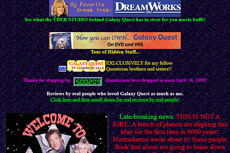
Similarly, with color, and layout, a lack of understanding design principles and concepts lead to hundreds of thousands of pages like the those shown above.

The other aspect of design that wasn’t understood by the masses was the presentation of information. The common approach was to show as much as possible. This again is ignoring a concept similar to the “Less is more” idea in that too much is not only overwhelming, but can be confusing and is likely to stop the reader from trying to continue. They need to address hierarchy of information in terms of both importance, as well as relevance (and that just 2 aspects of many more.)

The era of generative AI.

So much discussion is going on about the sudden wide adoption and use of generative AI starting with ChatGPT LLM models and stable diffusion models as well as other variants.

Most of the problems that are discussed are significant and important. The issue is that, as in the era of early DTP, the people who are discussing it and red flagging these issues are the professionals who already know how to code, or write professional content, or create illustrations and designs. These generative AI programs are designed to produce a convincing result. Unfortunately, it is not designed to produce an accurate one, although that may be a side effect of the process, it is not a guaranteed one. That lack of guarantee is important because it cannot validate it’s results. The sources of data for the training models are not validated for accuracy. The accuracy is based on a statistical approach where confidence isn’t absolute, even when the data may be.

What this means is that a professional software engineer can look at the AI generated code and assess whether it produces the correct result(s) as well as whether it got the result by the correct processes. Someone without that training or experience, can easily recognize that it got the correct result but not be able to assess if it did it in a correct manner. Not being able to assess this, the inexperienced person may use the code that later causes more significant problems because it doesn’t get the result in a correct manner, or there may be other unrecognized anomalies.

The same thing happens in design. The AI method is in a way a subtractive approach. Start with everything and progressively remove everything that is irrelevant or counter to the intent of the design. As designer work, they start with what the design is supposed to convey. The add to it to refine and clarify those initial intents. This way, they are always including only those aspects and ideas that convey the original intents. They can also see when unexpected things happen in the developing design.

When generative AI is used, by design, the output often includes many things that weren’t initially requested in order to fill out the canvas. Now, at this point, using the prompts, the user requesting the design, must spend a lot of time figuring out how to remove irrelevant or problematic artifacts. This seems like ‘design’ but really it’s more about removing junk and less about adding value. This time spent removing junk starts to be perceived as adding value. It isn’t though. Think of it like this: if you have an account in the bank with a negative value, bringing the account to 0 (zero) isn’t adding value, it’s removing the negative value. You don’t owe money anymore but your account is still at a 0 value. If you look at people using Midjourney publicly on Discord, you can see it often takes so many iterations of an illustration to be generated, with a new prompt every time to achieve a result. The common problem here is that the person entering the prompts become myopically focused on what it isn’t, that they forget or minimize what it’s supposed to be. It seems that the generating what seems to be finished artwork appears to be timesaving, but it appears that becomes a distraction from the focus on the original intent.

I want to point out that people who are using it for fun and for personal reasons, this is not relevant, as long as it’s only for that purpose. I think a safe way to use ChatGPT, for example, is to view every result, that you don’t already know to be true, as potentially wrong. Remember: it is designed to sound convincing, not to be correct.

Also, I personally think using generative AI with proper restraint can be one of several great ways to jumpstart ideation in any aspect of creation, design, or development.

Lastly, I do see great potential in generative AI, but it’s current ubiquitous availability and hugely prolific use by a mostly uncritical public is likely to take a long time to correct and adjust. The long term effects are going to be remain with us for a significant amount of time.

Posted in Uncategorized | Tagged , , , , | Leave a comment

UX failures: A BOTTOM TEN LIST

IMG_0132By Robert R Glaser, UX Architect

I make mistakes. Some of my greatest successes, in fact, most of them, all came from lessons learned. It would almost seem that any success that didn’t come from failure came from luck. For failure taught me through experience what would happen in very concrete terms, when I failed.

We are at a deluge of “Top 10 lists”. This list worked out to match that 10 through coincidence and not by intent. I tent to loathe the common facile top ten list as clickbait or worse a set of ostensible and rudimentary roles that should have been learned in the “101” level of any area of study, much less expertise. Sometimes 10 is too many, and far too often, it’s not enough. I think the thing that irks me about this trend is the implication that expertise can come from reading these lists. Notwithstanding this list below. It is a recipe approach to problem-solving. In this case, in UX. This recipe approach provides answers to specific problems but never with enough background to really understand whether the solution your about to apply will actually solve the problem or do so without causing other cascading problems.

So I thought I’d make a list of common problems caused by “instant expertise” solutions of these oversimplifications and maybe provide a way of avoiding them by providing some direction rather than solutions.

I intentionally didn’t put illustrations here, since this article is meant to be thoughtful and to let you think of your own examples. Often when pictures are provided, people tend to draw conclusions too quickly and without a thorough understanding of the ideas.

1. Anything that can be distilled to a top ten list, is cursory at best.

The internet is bursting with life hacks, memes and other suggestions that seem so amazing that anyone would have even thought of it. At the same time, so many of these suggestions for easier, faster, cheaper, better, solutions are often none of those epithets (or maybe just one.)

It gets worse when you start focusing on a particular field of work like UX (but by no means limited to it.) In these we are barraged with rules of thumb that are overgeneralized, or too specific, or highly limited, or so obvious that if you have to be told, you are in the wrong area of work or study.

Would you go to a Dr. who refreshed their knowledge of current medical practices by looking at a top ten list of missed symptoms of a stroke? These lists are actually and commonly recommended as an approach to successful articles and blogs. I rarely ever come across a list where I didn’t find myself thinking after reading only one or two of the list items and thinking “except when… ” followed by countless examples. This is not necessarily the often overly simple statements but rather the often-intractable completeness of them. This is often accomplished by the prefixes of “Always…” or “Never…” or some similar authoritarian language. By the way, this list is no exception, which is why I worded the 1st title as I did. The items here are meant to create awareness and begin dialogues, not provide exact rules in advanced UX design.

2. Check your facts.

I see so many lists with factual sounding statements (often by using technical jargon) which often don’t even make sense. I would expect anyone reading this blog to be just as skeptical, and you should be.

I read an article about color use recently that popped up in my email by one of those sites that regularly publish articles about different aspects of design. As I began reading, I noticed this string of statements.

Firstly, we need a shared language of color terms and definitions. This handy list is from our quick guide to choosing a color palette.

The vocabulary of color

Hue: what color something is, like blue or red

Chroma: how pure a color is; the lack of white, black or gray added to it

Saturation: the strength or weakness of a color

Value: how light or dark a color is

Tone: created by adding gray to a pure hue

Shade: created by adding black to a pure hue

Tint: created by adding white to a hue

What bothered me was the arbitrary mix of subtractive color models (typically the RYB or CMYK associated with physical pigments and dyes.) and additive color models (typically the RGB model associated with light and digital displays) terminology which shouldn’t be mixed, particularly when its preceded by the line:

Firstly, we need a shared language of color terms and definitions.

This article in itself referenced another article which used a standard I’d never heard of as a painter nor had I read it anywhere “Painters Color Mixing Terminology” implying this was a standard taxonomy. I have heard many of the terms, but never in such a structured and almost arbitrary way. One can simply use photoshop to see that the use of these seemingly defined terms, fall apart when one assumes that they mean something concrete with clear and consistent results. Additionally, the terms subtractive colors and additive colors in the function of an everyday designer, which are critical to design work which may appear in print and on the web where each is significant and understanding those differences is essential to the practical and technical aspects of implementing any quality aesthetic design.

Additionally, the referring article also included this quote as important information:

What colors mean

Red: energy, power, passion

Orange: joy, enthusiasm, creativity

Yellow: happiness, intellect, energy

Green: ambition, growth, freshness, safety

Blue: tranquility, confidence, intelligence

Purple: luxury, ambition, creativity

Black: power, elegance, mystery

White: cleanliness, purity, perfection

Any good UX designer would throw these out the window. What any color means changes wildly depending on what the context is, what the contemporary zeitgeist is, or the culture of the demographic that it is aimed at. For example, culturally, in the US red often indicates warning or danger, whereas in Japan it indicates happiness. But still, these are dependent to greater or lesser degrees on context. Not every international appearing design is as internationally accepted as the frequency of its use.

These examples are just based on one article about color alone. Other examples are myriad.

While I see and peruse a lot of UX sites, I have very few sites I read with regularity. These are the ones I trust. I’m not mentioning them because you as a reader and (I assume some of you are UX designers) should be selecting sites with some real critical thinking. I have a library of real books I can peruse as well as a wealth of online peer-reviewed literature. But I always let a healthy amount of skepticism be my guide. Even Wikipedia can be good for some foundational material as long as you check resources that may seem to be too good to be true to make sure you’re not unconsciously p-hacking yourself. Always try to prove yourself wrong, not right. PRoving yourself right is far easier and more difficult to refute misleading results due to ego.

Steve Allen, the late comic, composer, and writer, wrote in his book “Dumbth!” that lack of critical thinking, particularly in the case of taking experts assessments, reviews, and endorsements as fact. This lack of discernment is a common weak link in the chain of thought where rationalizing or biasing the opinion into fact has become a problem.

I welcome different perspectives and I’m sure that the statements I’ve made here are equally subject to them.

3. UX Design is an empirical science, psychology, and art.

I am almost pummeled with job offers for UX designers where rarely is the science of UX mentioned in anything more than a vague or oversimplified reference to user testing. Sometimes they will add more of the traditional jargon like wireframes (so often misused or misrepresented) and prototyping. What is rarely mentioned and is a red flag is that any of these UX science aspects of design are rarely indicated with any implication of support (financial or personnel). It’s as if all these tasks can easily and just as effectively be replaced by heuristics (often mine alone) and the use of “common sense” which is often the foundation in UX research for “false-consensus effect“. This is often poorly used as a cost-saving and time-saving measure. I can use my experience and good heuristic testing practices as a triage for user testing, but it is a poor substitute.

If there is a lot of language in there regarding the importance/significance of creating visual design assets, design guides, or other more visual aspects of design, then I’ll usually pass or ask if they are really looking for a visual designer with some UX background – which is basically a visual designer.

Conversely, if they require a lot of coding knowledge, front-end development, CSS, javascript, etc., then I’ll usually pass or ask if they are really looking for a developer.

The reason isn’t that I can’t do visual design (it was my original study in college) or that I can’t code (I actually went back to college to learn programming) but its because I want to design UX architecture. I don’t want to be a visual designer or software engineer. I like that I have enough knowledge and experience in these areas to be able to address UX in a way that I know can be implemented and if someone says “how can that be implemented?”, I can explain, in detail and with technical, specific references. These two skills are important skills, but when I’m writing code or deigning icon families, I’m not doing UX design.

4. UX Design should use the scientific method.

If you want to do an effective job at testing an interaction, test how it fails. Testing for success is both easier to do since it requires a far less rigorous approach, but it is also easier to cheat and bias the results even without malicious intent. I’m not referring to grand p-hacking news stories (although relevant) but rather the more subtle types of formative testing for the simplest of tasks.

I should also point out that the importance of appearance, while highly influenced by emotion and experience, can be quite variable, it is nonetheless measurable and should always be taken into account. This is where the assessment of quantitative results and qualitative results can reveal some surprising information.

5. Visual design is far less important unless your product is a commodity.

Generally, products either have a unique differentiator (something no one else has literally), or, a product’s differentiator could be not unique, but significantly better (faster, more accurate, more complete, simpler, cheaper) than a competitor. In these first two cases, visual design (if it’s not an inherent function of the product) is one of the last things to be considered in its design. This is because a differentiator needs to be both introduced and made to appear intuitive (even if it really isn’t). This is done through UX architecture such as user research, interactive design, formative iterative testing, and any other areas of ideation that may be available depending on the resources (primarily people) available.

Before the visual design is even addressed (again, excluding things that require certain visual requirements like standardized colors for stop/go, start/stop, warning/failure. Even these though should remain as words for as long as possible.

The reason for this is that visual design biases early iterative testing into creating artificial mental models that become improperly reinforced.

But if the product is at the commodity level such as a website for a store of any type, then the approach changes. Here visual design can begin far earlier but concurrently with the interactive design. In the early stages here, branding concepts such as palettes, layout schemas, font and assets standards, and designs can be explored in a componentized and scalable manner so that when the visual elements are then integrated with the interactive elements. This approach works more harmoniously in a collaborative way.

6. Formal training in UX or visual design isn’t just a “nice-to-have”.

As someone who has had formal training (i.e. University, or some nationally accredited by a professional or governing body), been self-taught, and been taught on the job, each has its advantages. One of the greatest advantages of formal training is the importance of the reduction of ego in the design process. This isn’t just so that the designer can handle criticism, but welcome it, learn from it and use it with equal constructive use on colleagues and reports. Early on in my career, I was occasionally suspicious if I didn’t get some criticism on any submission. It usually meant it was viewed in a cursory manner. While sometimes I would be told that my work was of a quality that didn’t require constant supervision (a wonderful thing to hear) it also quickly taught me that I had to improve my own self reviewing process which I still do to this day.

I have learned many things through self-taught study, both informally through training books and online courses and personal experiments, it still lacks the 2nd and 3rd party interactive review throughout the process. Learning on the job can do a far better job at this although, the learning may be less consistent due to meeting your job requirements and deadlines.

I particularly enjoy mentoring whenever I can. I used to say “There are no stupid questions.” But now there is a caveat: “It isn’t stupid until you ask the same question over again.” I realize that someone may not fully understand something without realizing it, but there is also a point where it is up to the learner to ask more follow up questions until they understand why something is being done and not simply that it has to be done.

7. Context is everything.

The context of a user experience sometimes seems so obvious that it needn’t be recorded or enumerated. This is often an error. In formal or complex systems, it’s essential, but in informal or common situations, it should still be addressed, even if informally, so long as it is recorded somewhere in the process. The reason for this is that we often overlook obvious things because they are often automatic in their execution, autonomically prefiltered sensory input such as background noise (audio, visual, or cognitive) and so on.

Two instances where I found this to have been a critical issue that was addressed far too late were:

  1. Designing (actually just updating) the UX for a cars infotainment system. Just looking at the data of mental models for media players on phones and in cars gave a rough idea. Additionally, there were the companies differentiating features, not the least of which was A.I. and machine learning in the media selection process. As a proxy, tablets were used and even in-dash prototypes would be used. All of these pieces of information were very helpful, but a flawed contextual assumption was testing without driving. While driver distraction was addressed in the assumptive paradigms, they were not tested in real-life situations. This required some significant changes to the design recommendations that were counter to the product requirements due to the simplest of use cases.
  2. When designing for an enterprise radiology workflow, I was aware that the majority of enterprise radiologists worked in dark rooms and so this was taken into account in the design paradigm. However, when simply sitting and watching a variety of radiologists with different areas of specialization work in these dark rooms, it became apparent that differentiators in screen data could not only be reduced but had to be like the current versions that these radiologists were using was clearly distracting in a way that affected their attitudes while doing their diagnostic work. While this change was not asked for by users or listed by product management, once implemented, the response was overwhelmingly positive, with no negative responses.

Each of these issues was addressed but later in the development cycle where they required resources and time were far higher than they would have been had these issues been noted properly earlier on. Incidentally, these two specifics were not the only ones but were two that could be fairly briefly described.

8. Flexible and scalable design or quick design.

Most people have heard the old saying “Better, faster, and cheaper: pick two.” This is similar in UX design although simplified into two choices rather than three. You can’t do both and you need to understand that each has its advantages and disadvantages. A design that is flexible and scalable requires much more time at the beginning since a fairly detailed understanding of the user and system ecosystem are necessary to design in this way. This deeper understanding of the system allows a more componentized approach to UX design since you can reduce the frequency and increase the speed of validation in the formative states. Additionally, it can facilitate more scalable and agile engineering development once the designs reach that phase of development. Also, way down the road when you get to more summative testing, adaptation is easier and often allows faster decision making when there are important benchmarks and deadlines. This slower beginning though often requires a somewhat defensive stance since there’s often not a lot to show soon. I should note that flexibility in design and scalability in design, while different, can be fairly easily designed concurrently with little time or resource reduction if only one is addressed since the same resources and many of the same design considerations are used for both.

The quick design approach allows MVP to get to market or at least shareholders and sales far quicker. This approach of being fast and dazzling can be a boon to a startup with no product yet in the market. There is something very compelling about having a working product as opposed to a prototype in hand. It doesn’t show what its supposed to do but rather what it does do. The big drawbacks come when changes or a new version needs to be made. Hardcoding of applications require major rework if not rebuilding the base code from scratch. Additionally, from the purely UX point, fast design, while providing a UX solution for that specific product (even if it’s the first design) is likely to create both expectations and mental models which are incompatible with new or different features and can cause user fatigue, user conversion issues, inconsistent user expectations cause by the earlier mental model, leading to frustration even though the newer/replacement/update product is better in terms of quality, features, and reliability.

Jared Spool wrote an excellent and more expensive article a few years ago on this called Experience Rot.

9. Don’t espouse good practices and then not follow them, or worse punish those who do.

So often there are things I’ve heard over and over in various companies. These are often well known (both because of popular repetition and the truth behind them.) The biggest cause of this problem is either or both fear and ego.

  • Don’t be afraid to fail. I’ve witnessed numerous punishments and more than a few firings due to many genuinely innovative initiatives that fell short even though the reasoning for failure may have been insufficient development time, unknown variables, and even while being successful, being considered a failure against the exact letter of the original hypothesis. In many of these cases, there was significant and usable invention and innovation that often was utilized later. These failures were punished because someone in a decision-making position either felt threatened, or they would cancel a program due to fear of failure rather than the potential for success since job loss and sometimes fragile egos are bigger than accolades and ROI.
  • Experience is essential and then placing hierarchy over experience. In an ideal, in fact, in many regular businesses, good leadership will hire experts to advise and help the company succeed. Often, though, a long relationship with an industry does not always mean a thorough understanding of it. Knowing the politics of an industry, never equates to knowing the technology of it. Both are separate domains of information and like many areas of knowledge, each requires (1. study, (2. practice, (3. many failures and (4. enough successes to address a luck factor, for genuine expertise. I know enough about corporate politics to realize that I want to only be involved when necessary and no more than that. But I also know that someone’s experience in the political aspects of a product or project doesn’t outweigh the technical/production side of it.
  • End meetings without a confirmed and mutually understood consensus. I have been to so many meetings where not only nothing was decided, but virtually everyone left believing that there was a decision and whatever they thought that was is what they are going to be acting on. Even a meeting where nothing is decided or resolved is ok as long as everyone leaves with that understanding. There is plenty of good basic meeting best practices out there. My point is to simply follow them.
  • We have a long-term plan but then you realize that it can change week to week or even day to day based on Knee jerk reactions at the decision-making level, so often that more resources are depleted to spinning up and spinning down rather than to actually producing anything. I of reference this in a paradigm I refer to as the “Sitcom logic approach.” This is where an idea to do something is presented and on its first (and only) run, fails hysterically (it is a sitcom and fixing it wouldn’t be funny.) Of course, what then happens is that the idea is abandoned for something else. No one tries to figure out what went wrong and whether it is fixable. Often these failure points are more likely to be minor missed considerations rather than catastrophic conceptual errors.
  • “No.” and “I don’t know?” are negative only if viewed from an ego standpoint. Dismissing or shutting someone down for these statements is in the first case (“No”), dismissing their experience and knowledge beyond what you may know. The second “I don’t know” dismisses curiosity and an opportunity to learn and innovate.
    Adam Grant has spoken and written about the successfulness of those whose careful use of “No” has improved their productivity, businesses, products, and more. I highly recommend Adams books and videos. So if you follow through on that, I needn’t simply repeat it.
    As for the “I don’t know” in the design world, ego relegates this to lack of intelligence and inexperience when the opposite is generally true. Interestingly, it is the primary door to both knowledge and experience. First, because, when you say it, you are responding to a question or situation to which you have know answer or response. This provides you with exactly the subjects or concepts you need to learn about. While learning about those subjects, you have the opportunity to relate them to your own life experiences, often as they are happening around you. This second part provides the first form of experience, and that is basic observation. The second part of experience come from when you decide to put the newly learned concepts and ideas into practice to see where and how they succeed and fail.
  • “Standards” that are really just “Trends”. There are so many examples of this that I don’t think it would be too difficult to compile a top 100 trends that became standards but still went away as trends do just more slowly because far more money and time was invested in it. I’m just going to use one example: the open office environment. As someone who has been around worked in office building with actual offices to “office” buildings which look like well decorated warehouses with modern desks. I began seeing the first long-term studies almost 20 years ago referencing the actual inefficacy of the environment. Not surprisingly studies continue to reveal the same thing.
    • They are intended to foster collaboration – but they reduce it
    • They are meant to create a more social environment – but they increase the need for privacy beyond what would be normal privacy expectations.
    • They increase distraction
    • They reduce productivity
    • They increase offsite work even when that’s not the desired effect.

The part I find amusing is that most of the adaptations to the problems of the open office environment are symptomatic cures and don’t address the actual problem. Things like privacy rooms, quiet areas or comfort areas, gaming areas.

10. The UX unicorn problem.

I am a UX architect who started out as a graphic designer (because that what we were called back then.) I was an editorial art director in medical publishing, I designed advertising for everything from food courts to couture retail. Then I got a job at Xerox. That began my journey into what was to become UX, through early (and unbelievably expensive computer graphics and animation), years of instructional design and early computer-based training, and so I went back to college to learn programming. This was useful since it taught me two things, 1st: how to design and write code. 2nd: that I didn’t want to be a programmer, but it was incredibly useful to understand what was going on in code and how to engage with software engineers. I then spent time developing programs and learning about the complexities between how people interact with machines, computers and sometimes simply objects. I got work with a lot of testing environments from summative testing in highly controlled labs with eye tracking equipment, to simple formative testing with both quantitative and qualitative results as needed. I did a stint at Gartner designing data visualizations for their top consultants for their world symposia, and designed UX VOIP systems (for regular users to administrators) for what used to be ShoreTel (now part of Mitel). I’ve designed radiology enterprise systems (PACS) and Voice controlled and enabled vehicle infotainment systems.

With all that, I find the Unicorn designation to be problematic. While I can do a lot of things because I’ve had a broad experience, I would rather apply all that experience to creating really elegant and effective UX. This doesn’t mean something that is spectacular, because that’s really more about visual design and if the process for the user is not about the result of what they want to accomplish. It doesn’t mean something that’s really interesting interaction experience since that applies to game design more than common UX. I have often said and will continue to say, if my work is noticed by the user, I have failed. This goes well beyond the rudimentary expression “If the UI needs to be explained the UX has failed.”

Here is where the Socratic quote, “The more you know, the more you realize you don’t know.” Becomes so apparent. This is important here because while the unicorn UXer seems to be able to do so many things. It means also that for all the time that they are doing user research, they are not doing strategic design. For all the time that they are organizing, running, and analyzing user tests, they are not designing wireframes. All the time they are creating visual assets, they are not establishing a design language with its documentation. All the time that they are managing tactical aspects of implementation, is time better spent on establishing the standards of Human Interaction Guidelines. Software development gets distributed and delegated but there is so often an expectation that for no good reason that a UX designer can do everything concurrently.

For all the boasting of the UX being of paramount importance to many companies, so many invest precious few resources to it nor understand its complexity and process. So when I see a company is looking for a UX designer who’s a unicorn, its typically going to be either an underpaid position which will either set them up for scapegoating or burn out the employee in no time. On the other hand, it may be more likely that they are hiring for a position for which they do not really understand the importance of the needs of the user, all the while being certain that they “Just know because it’s common sense.” This dangerously and incorrectly commodifies UX design work, and worse than that, almost forces mediocre work. It removes the ability of the UX designer to design an elegant interaction and forces them into a high-speed triage situation. These situations do happen in the best of circumstances and having a solid grounding in formal training and many years of experience increases the likelihood that the quick solution will be a good one. It is, however, a bad approach to design and development.

In summary

While I’m often surprised at the amazing outputs which were based on the luck of an early idea being successful, I’m far more impressed when the success of the outcome is from diligent well thought out work since this kind of work will far more likely lead to further successful improvements in the future.

Posted in Uncategorized | 1 Comment

The sitcom logic approach to failure.

By Robert R Glaser
UX designer and architect.

This is an issue that seems omnipresent in many businesses save for a miniscule percentage. It is often replaced by a bulldozer approach or worse a decision based on a random guess approach to problem solving.

What do I mean by this? Well its surprisingly easy to describe and will be easy to recognize. Whether you watch old sitcom on TVLand or new ones on a streaming service, the plot device is used commonly in sitcoms is that the one or more characters are presented with a problem (e.g. suddenly needing cash, or meeting someone, or fixing something.) They quickly realize what needs to be done and then devise a method to achieve the results. This method is typically silly and irrelevant. Something happens which quashes their process, so they fail. (Here’s where the sitcom logic comes in) After failure, the concept is discarded in whole without a thorough postmortem to determine where the problem truly lies which is usually the method for the solution which for the sake of the sitcom is usually silly. Although often a review is performed and maybe some superficial details are addressed but not thoroughly enough, so the entire project (including the initial theory, which is usually valid) is discarded.

Jeff Catlin in Forbes talks about the failure of IBM “Watson for Oncology for MD Anderson due to lack of consideration of varying cultural models and have a 62-million-dollar investment halted. Interestingly, I had previously worked at Phillips Healthcare and one of the aspects I had to consider in any [UX] design work was that the resultant design needed to work in multiple markets outside the US. So, for example, something that has little or no value in the US may have significant or even critical value in Germany or the U.K.

Another example is expressed through the issue of innovation and invention without proper commercialization. The story of the Apple visits to Xerox PARC has become mythologized, but in the long run, Xerox and Apple both had technologies which revolutionized the personal computer industry. The difference is that Apple didn’t discard or ignore these technologies, but rather commercialized them (which was significantly surpassed by Microsoft) to the point where they are ubiquitous across the industry of hardware and operating systems and applications.

Don Norman has talked about how it often takes decades for a new technology to be adopted on a massive scale. This adoption isn’t merely waiting for it to be cost-effective but rather that it be viewed as non-threatening in nature (even if it never was) or not foreign in its mental model, even though its actually easier to use or manipulate. He has used the touch screen as an example that took over 30 years to become ubiquitous (from it’s functional invention in 1975 and first production in 1982 to the real large-scale adoption with the iPhone’s release in 2007.)

My own experience has shown this is often true, particularly when some new technology is trendy. It is common for people to present it as a possible solution or methodology that is forward-looking without the background check of (even superficially) of determining whether it’s actually useful or appropriate for the case at hand. Currently, I work on the in-vehicle experience and see what technology can be used to support it. The most frequent error I hear is “Why don’t we do x because I can do that on my smartphone” without the simple consideration of the fact that cell phone use in cars is limited (to varying amounts dependent on individual State Laws, some of which allow you to do almost nothing with a cell phone.) While it seems obvious to some, most people don’t realize that the mental model is significantly different. Using a smartphone by the average smartphone user requires or draws full attention sometimes to the point of being unexpectedly and dangerously undivided. If you have seen the youtube videos of people walking into walls, polls, other objects, and even people while interacting with some social media or games, feel free to look it up.

Decisions that are made need to cover a range of issues and those issues should be graded based on how and what biases drove them. Common food is a good way of demonstrating this. If you poll people across the US to find out their favorite foods and also what foods are the most consumed, you will probably find there is some overlap but that they are not the same. You would also find out that these change over time. There are significant variables like cost, availability, and trends that have a significant effect on these. There are other variables as well and this list changes significantly between regions and even more so if you start considering countries outside of the US. Here, an important issue is brought forth. The more people are added to the averaging process, the less likely you will have a genuinely ‘average person’.

What this means from a UX standpoint is that designing to the average creates a mediocre outcome for most. So you may have an excellent theory for the UX but the data that it is based on drives the method for a solution that takes no individual into account and therefore, often, pleases few users. The difficulty here is in figuring out how to effectively subdivide the user population so that each subdivision has a way of letting the UX be seemingly (as opposed to discrete customization made by a user) customized to them. These subdivisions can be by age, culture (geographical and/or racial and/or religious), economic, sex/gender, and educational. There may be other subdivisions depending on the target audience. Some of these may not be relevant to a specific case, but they should be addressed before they are dismissed. This issue is a common driver of mediocrity or worse, failure.

What often happens here is an example common in application development where the placing all features at the same level overwhelms the user. The mistake that is certain features are eliminated (along with the users who find those important) rather than finding out how to address smaller percentages of users. This can cause a failure of the application to gain a growing or even sustainable user base.

These kinds of issues are common in applications with large feature sets. You would be unlikely to find a user (other than a person certified to teach the use of the application) who used all of the features of a complex system. Complex applications like this often have overlapping user bases which utilize the application for different purposes. Adobe’s Photoshop is a good example of this which can be seen by opening and examining all the menus and submenus available. It has users who are professional illustrators, or photographic cleaner/retouchers, or visual designers for applications development (both software and hardware) in addition to hobbyists, and even people who specialize in creating maps for cgi (3D) work. There are sets of tools for each of these groups which are often never used by other groups but are critical to the work of a specific group. The interface for Photoshop is customizable for optimization of whatever the user’s primary task is. There are also features which overlap several groups and a few features which are used by all groups. When decision makers are either out of touch with the actual users, or worse believe that their own use paradigm is (or should be) applicable to all.

So when, in circumstances such as this, there is a failure, and the solution is discarded then there is often a reconfiguration of the problem under the assumption without review, that the initial problem was wrong when in fact it was the solution that was wrong. For example, there isn’t a simple review to determine whether the problem being solved is actually needed. I may have a revolutionary solution to a problem, but if no one has any interest in solving that problem, then the implementation may be successful but the product fails.

Really innovative companies release products usually with a primary intent for a product and some ancillary solutions as well. Once in the market, the users focus primarily on one or more of the ancillary capabilities and focus minimally, if at all on the primary function. The company then realizes that instead of seeing the product as a failure, simply starts focusing on the secondary functionality as the new primary feature(s.) If they are really driven by the user’s needs, then they will genuinely asses whether the primary function is simply not needed, or was not well implemented. It really takes some fairly rigorous evaluation by the decision makers to see past their individual confirmation biases.

Personally, I learned a long time ago the deep importance of “I am not the user.” This has been really useful when going through user result analysis. Outside of basic heuristic evaluations, I always assume that my preferences are atypical and therefore irrelevant. This way I’m more open to alternative viewpoints and particularly interested in the times when many of those alternative viewpoints are similar. That becomes a simple if unexpected, target. I can then see whether the original problem definition was wrong or the solution was wrong, or maybe both. We do learn from our failures.

Posted in Uncategorized | Leave a comment

Why we should be removing ‘democracy’ from Design Thinking (and maybe Agile/Scrum processes too.)

Design Thinking circle-02

By Bob Glaser, UX designer

Design Thinking has been around for almost half a century. It has been used successfully for many of those years and yet, as it has gained significant momentum in the last decade, it has also been reformulated, varied, simplified, altered and ‘fixed’ by various purveyors. Many of these, for the purpose of repackaging and more importantly, reselling the concept as a training program or consultancy. Because of the breadth of design thinking, I’m assuming that the reader is already aware and likely in use of design thinking. Therefor, I will not go into a detailed description of design thinking.

One (of many) concepts that I have seen as a corrupting influence on outcomes is the input of democratic decision making into the process. Why is this corrupting (bad) to the success of the process. It is because it can have the effect of dismissing the very real positive outcomes of the process.

How?

First, let us consider the process. For the sake of clarity, I’ll choose the Nielsen Norman Group’s descriptor of the process since it addresses it in an strightforward applicable way, rather than in a broadly conceptual way. (There are many other versions out there that are also suitable, including some of the original concepts which were well refined by Stanford School of Design which had simplified the original 7 steps to 5, but some are overly detailed for the purpose of this post, even though they are just as exposed to the democratic corruption.)

That process is simple in its semi-linear circular iterative process:

  1. Empathize
  2. Define
  3. Ideate
  4. Prototype
  5. Test
  6. Implement

The first 2 are the ‘Understand’ phase, 3-4 are the ‘Explore’ phase and finally 5-6 are the ‘Materialize’ phase.

Since the process combines the seemingly paradoxical pairings of logic with imagination, and systemic reasoning with intuition, it is susceptible to being adapted in a way that can defeat the purpose of the processes results through corruption.

When a group begins this process, they consider the user’s needs, the business’ resources/viability, and the technical feasibility/capabilities. They then follow the process and come up with potential solution(s).

The problem arises at this point.

This common error, is taking potential solutions and voting on them. The problem with this approach, is that it tends to cast the base concepts out the window in order to determine a solution. Sometimes the vote is determined by some constraints such as choosing low hanging fruit even though these are low on the priorities because of the fact that they are easiest to deal with. This is often followed by the idea of resource limitations that may be artificially imposed. This may be stated like this “We are only considering the solutions which can be accomplished in [time frame] (or some sort of similar artificially or arbitrary constraints. Then the group votes on solutions based on these constraints.

Since the purpose of this process is to determine the solutions that need to be addressed*, the results are corrupted by a democratic vote which dismisses the effective and hopefully innovative result. The use of intuition and imagination of the solution creation process is being carried into a realm concurrently with logic and empirical decision making. Design thinking is meant to use these empathetic concepts to help frame or reframe the problems and potential solutions with an approach that brings creativity to the process rather than just a methodical scientific method process alone, and thereby produces more innovative solutions. It should be noted that design thinking is simply one of many ways to help produce effective implementable solutions.

The vote may easily (or regularly) concatenate the solutions and therefore eliminate the best, ideal or most effective solutions from the standpoint of the user.

*Design Thinking is a solution perspective as opposed to the problem perspective of the scientific method.

How to deal with this democratic corruption?

This is fairly easy though often not popular because it requires a little extra effort. When the group is in the early stages of gathering information (Understanding phase) they should also be defining the requirements of acceptance. These requirements are what the solutions should be put into to filter the results that will be implemented. If one is determining the requirements of MVP (minimum viable product) then it should be easy to simply say that a solution is effective but not necessary for MVP while another solution is absolutely required for MVP. Then when it comes to the ones that may or may not make it, the same criteria are applied and instead of addressing the egos of the design thinking process participants (in the business/company), the results will address the needs of the users.

This is not a flawless approach, but it helps define requirements for solutions more effectively. If it doesn’t, then that lack of effectiveness becomes a solution issue for the next iterative round of the process.

I should note that this particular issue came to me in sprint planning meetings where what will be accomplished is not based on needs, but rather schedule first, then resources, then needs. In this scenario, “needs” are the first thing that gets dropped because it’s priority is wrongly demoted to last. Design thinking places it first, and if the democratic corruption doesn’t demote it, then it remains in the forefront where it should be.

I should also note that processes that are not user oriented (directly) can still be effectively addressed by design thinking by considering the indirect effects on people, of the process(es) being addressed.}

Posted in Agile, Design Thinking, MVP, Scrum, UX Strategy | Leave a comment

Correctly Dealing with 5% Use-case

I have noticed a common myopic view of the handling of edge cases around +-5% use-cases features (those features that are addressed by only 5%, give or take of users. These can be outlier, expert users, or special situation users (by job, environment, age, or other demographic.) I should note that the 5% is an quasi-arbitrary small number. It is meant to represent a portion of users that isn’t so small as to be outside of the MVP population, nor large enough to automatically consider it as a primary use case. It will and should vary depending on the size of the user base and the complexity of the application.

The problem is that this group of users is often either not parsed properly, or not defined as cumulative grouping. These exceptions tend to be handled exceptionally well in some highly complex professional applications (in terms of being highly loaded with specialty features) such as Photoshop or some Enterprise Medical Imaging software as a few good examples. Other than these cases, these are used improperly by many UX designers or company defined design process which are often, though not always, outdated.

Concept, execution or explanation.

I’ve seen many concepts and projects fail, not because they weren’t good, useful and saleable products. The problem was because the product was mark as a failure because a lack of understanding as to either the problem that it solved, or the benefit it provided.

The solutions can be:

  • A simple visual that easily displays a complex interaction in a simple manner of literally showing the difference in real-time and real-life manner.
  • Or it may be with a simple overall description that encompasses a sometime incomprehensible number of features or even the features are not the focus but rather the ‘simple’ integration is.
  • Dealing with an ineffective or even inappropriate (business-wise) choice of data that is being used as the comparative sample that fails to present the benefit of a concept.

The first example often happens when dealing with an audience that may not be able visualize the solution being described. This inability to visualize opens the door to all kinds of cognitive biases. For example, in a fairly necessarily complex UI I was working on, I had suggested a simple fine (2 pixel line) around an active study (in a radiology environment.) This description was dismissed and then a myriad of grotesque solutions were proposed. These were too severe and problematic to consider for implementation since most focused on one aspect with considering the complexity of the UI. So, I showed in a simple two page powerpoint how it would appear if a radiologist selected a study. The concept, previous rejected, was unanimously approved (by both sales leaders as well as clinical specialists), simply because the actual images were “real” in terms of how it would look exactly on the screen (with nothing left to the imagination.)

The second example comes from having an application that can do many things through a central integration point. Each of these features has a high level of desirability to overlapping markets. The problem became apparent when questions from the audience would sidetrack the central focus (because it was not clearly defined) and then the presentation devolved into a litany of features (few of which were particularly remarkable on their and others were remarkable but undifferentiated from the less remarkable features.) Here the solution was to present the idea of integration and a central focus point as being the true benefit of all of these features.

The third example is surprisingly common. Here, the functionality is properly and thoroughly presented but the sample data being used is too small or too random to demonstrate effective results, or not ‘real enough’ to be able to correlate with results that demonstrate the power of the functionality. For example, perhaps the functionality is a way to present the use of a home based IoT climate control system using machine learning to learn usage pattern for specific households. If the database being used is not based on real aggregated database of individual home data points and is in fact an artificially generated database based on a real data but randomized for because of privacy or security concerns, then the resultant analytics will be equally randomized and fairly useless, since it would be impossible to show actual use-cases for various demographic (or other) filters. So the resultant displays from the algorithms may be dynamic, but they would show no real consequential and actionable results. This would lead the audience to simply see that this does something but cannot see how it could show me anything useful, whether it was basic information or unexpected patterns of specific groups. This ends up being a lot of effort whose result isn’t much better than simply saying “Believe me, it really works, even though you can’t see it here.”

Also consider:

Another aspect of this 5% user base is that the use-case could be a critical but one time use for 5% of the population, or it could be a regular required use for 5% of the population. While this 5%, regardless of which of these to groups your addressing, could be a different 5% for each of 19 more features/capabilities. In the first case, it can be buried in the preferences, while the later could be buried in the 2nd level (2 clicks away) with the option of custom shortcut implementation.

These may seem obvious, but the require diligence because they are often considered during a specific phase of design and development, when they should be considered all through the design process, from ideation through post production maintenance and version increments as well as postmortems.

Summary:

This is a cursory observation of the problem (meant to initiate the conversation.) There is no one solution to this issue, rather the problem should be considered in advance of the presentation and then a proleptic approach becomes a more effective presentation structure. I personally like to think of it as using scientific method to create the presentation of the concept. Theorize, test, focus on flaws, not positives (assume that the positive is the initial concept that your trying to find flaws in before someone else does, or to simply validate the quality of the concept itself), and fix it if possible.

Posted in Uncategorized | Leave a comment

Correcting perspectives in UX design

sextant

There are several factors that guide the UX that are accepted.

  • Its effectiveness (simplicity, ease, and functionality.)
  • Its lack of obtrusiveness (it gets your attention based on criticality or “on demand” need.)
  • Its implementation of accepted technology vs. new technology within a domain.
  • Its forgiveness of error.

Effectiveness

This is often a catchpoint. The level of simplicity needs to be commensurate with the task at hand. For example: contacting someone vs. performing a diagnostic procedure. The common error here is negative simplification – that is simplifying a complex process to improve numbers of viewers without considering that the process requires many possible branching decisions, each of which may reveal a new set of choices. If a product is a single function tool, then the MVP (Minimum Viable Product) is easy to define. If, however, the product is a set of tools used to complete a generalized task, then we can often (not always) infer that the completion of the task may require a constantly changing set of tools due to unknown variables. In the later case there are some tools which will be used all the time and others that will be used less frequently but it is important that the less frequently used tools are ALWAYS available because their need/availability cannot be determined at the beginning of the process.

Part of this issue is the determination of the importance of the task and its related processes. For example, in surgery, most processes are critical even if no unexpected errors or situations are presented. A phone call on the other hand could be casual and of minor personal value or one of critical need depending on the situation. Further, a game poses no threats at all, but may anger a user if there are bugs in the process of play. Lastly is the capturing of information. This can be simple like writing or recording and only done for reference or posterity but not required for the presentation of the information which may be meant for listening only. The capture in this case is an indirect reinforcement of hearing/seeing the presentation of information but does not have any actual effect on the outcome of that information. (This, like many concepts could easily be rabbit holed, but I use these ideas for high level differentiation.)

In terms of ease of use, it has to be defined as to whether it should be easy to use. Child-proof safety tops or catches are just such an example of the fact that ease of use should not be applied blindly to everything as they are, by design, intended to limit the users to those who can already understand the reason for use. The same can be applied to professional applications where complex work requires a complex tool set.

Lastly is functionality. There are many complex processes that can be simplified, while there are other complex processes for which simplification reduces the effectiveness because decision points that allow “on-the-fly” adjustments to environmental and other unpredictable variables, when removed can produce flawed, if not catastrophic, results.

Obtrusiveness

This function varies based on use case. Often, without a fairly fully effective AI, there is often no way to determine what should draw the users attention to an attribute of a complex system. There may be regulatory, safety or security requirements that define the minimum parameters for this manner of getting the users attention, but it still doesn’t address when there are multiple points of attention of similar weight/value that are required concurrently. In these cases, it is up to the user to determine which to act on and in what order. Again, unknown variables may affect, necessarily, the user’s process. These variables may be presented in ways that the tool is not designed for. This doesn’t mean that the tool should be altered, as it may already be a highly effective single function tool, but rather it can be left to the user to determine the order based on this assessment of newly or suddenly presented variables. That is why I mentioned that only a fully effective (and mostly non-existent) AI would be required.

If we define the rules by which something should be presented to the user based on empirical use cases and also mitigate the potential issues that may happen if the information is ignored or missed, then it becomes far easier to implement it. It’s just that it’s not that common that those use cases will safely cover errors that could be problematic.

Then there is the issue of what method is used. Here, we should keep in mind that new technology is far more quickly accepted by the product development community than the world at large. This has to do with issues of confidence (will it work right?), trust (do I want to share this information?) and technological maturity (can I afford it? Or is it too cumbersome?)

Consider the concept of the future in the 1950’s with the idea of the TV-picture phone. It was perceived as a marvel of new technology, but what no one thought about was that people didn’t want to be seen at home in their underwear when they answered a phone in the early morning. It was decades before skype and facetime were used with some regularity, and even then only when people were prepared to use it. It’s still mostly used by people making long distance calls ‘back home’ perhaps to another country, or in long distance business interviews and conferences. Even now, if I think of the last three companies I have worked at, I have often seen content being shared but only extremely rarely seen live streams of video of people in these conferences. There is a level of privacy that people still hold onto across the globe when it comes to what and how much they wish to share in a communique.

There are other similar issues with new technology that are foreign to many users and also for which there is no standard. Even gestural touch interfaces don’t have a consistent standard yet even though they became widely available almost a decade ago. Even if there are cultural pseudo-standards in place, they are often context specific. “Swipe right” has different connotations depending on the context which it is used. Even the order of digits on a phone keypad and calculator keypad are not harmonized (a dialpad has the “1” in the upper left corner while the calculator has “7” in the upper left corner; this is congruent with common mental models of data chunking.)

Accepted vs. New technology.

The touch screen has been around for half a century but not widely accepted until the last decade and even that wasn’t instantaneous particularly, as mentioned above, the lack of any standardization (other than implication) of gestural use.

While technologies like VR have great possibilities, there is still the issues of acceptance, standardization of use and issues like motion sickness that have not yet been dealt with effectively.

Additionally, there is often a mistake in perception of any area of growth that discounts leveling off or even drop off from either saturation of the market, replacement by another different technology trend, even if less effective or simply limitations of a technology when it reaches the point of diminishing returns.

Since I live in Silicon Valley, there is often this bubble effect of people seeing technology all around them and assuming that it is ubiquitous when in fact it may only be ‘ubiquitous’ in high technology and/or areas of high median income. As soon as these inhabitants step into a more common area outside, they realize that the very technology they may depend on is not only not available but may also be viewed with suspicion. Consider the rise and fall of the Google Glass. While the technology was amazing to those early adopters, they hadn’t considered that many others saw it as an invasion of their privacy. It wasn’t uncommon to hear a conversation between someone wearing the Google Glass and another, where the other person would say “are you recording me?” and then not really believing whether they were or not regardless of what the Google Glass wearer said. This is not to say that it was useless, but rather that it would be more effective only in specific situations but not acceptable in many others.

Other types of feedback systems from haptic to neurological implants have promise but are still far to nascent to expect wide acceptance.

Error forgiveness.

This goes far beyond the system error of the past. Here is an area of constant annoyance. Consider the fact that there are whole internet sites devoted to posting the sometimes hilarious/embarrassing mistakes of autocorrect. This idea of “I like it when it works.” is a common cry amongst texting pairs who haven’t turned it off. As it stands currently it can speed up the communication but it can also lead to rather severe errors.

While basic machine learning algorithms can address this, it would take a deep learning algorithm to learn the cadence and style of an individual’s communication style including things like context, intent (sincerity vs, sarcasm), interests, vocabulary level, etc. along with the context of the person your conversing with since the language between a parent and child and two intimate partners may be extremely different even though two of those people could be the same person. This makes for complex interactions that can’t be ignored.

 One final note:

Most of my posts are directed at more advanced areas of UX design. It is for this reason that there are not a lot of pictures as samples. I point out examples within my post as anyone beyond the beginner (and any critical thinking beginner) will understand. Additionally, I find superfluous imagery tends to belong more with “top ten” lists and other basic concepts in design. I will always use imagery when it simplifies or clarifies a particularly different, new or complex concept. Imagery can also be limiting to the conversation as any advanced designer will already have a good imagination at visualizing how a concept fits their milieu of design work.


Posted in Uncategorized | Leave a comment

Honesty in UX

By Bob Glaser, UX Architectelephant-in-the-room

One of the great inefficiencies in UX design comes from the various forms of lack of honesty. This happens in both individual design and collaborative design. I chose that wording because dishonesty implies intent while “lack of honesty” includes neglect, cognitive biases, etc that along with intent. While empathy with the user is an essential component. Rigorous and sometimes brutal honesty is essential to good UX design.

If you can accept kudos for successes, then you must accept blame for failures. Failures generally teach us more than successes. “Best” is a comparative term with no indication on the scale of total failure (0 if you will) and perfection (~ infinity if you will) based only on what currently exists. Even then, only if all previous incarnations of a concept rate at. for example, 5 and you’ve met the 10 mark then you have improved the concept by 100%, but, you have no way of knowing if perfection is 15 or 150000). This allows us to easily stagnate on the laurels of success.

Failures, however, are concrete or finite. Through rigorous honesty, we can and always should find the root causes. There’s almost always more than one cause, so you shouldn’t stop failure investigation once one answer is determined. Here is a good place to implement the “5 whys approach” as a start. The five why’s are well described in many Lean processes so I’ll not repeat them here.

It’s perfectly acceptable to make myself unpopular in meetings when, after presenting a solution to a user’s problem as being successful in user testing, hearing an internal (within the company*) comment of “I don’t like it.”, “It’s ugly.”, “It’s too plain.”, “It’s not exciting.”, etc., the response ought to be “Thank you for your opinion but it is not relevant here. You are not the user and neither am I.” The aggregated feedback from user testing is factual. I am quite aware that both formative and summative user testing may, by the necessity of the product design and use, require user opinion but this opinion is part of the aggregate scoring and should be both consistent in its testing application, non-leading in it’s style, and evenly distributed for accurate representation in the aggregate totals. The comments made are always taken into account though, because they may point out an area of potential improvement. Here is where we appropriately balance the objective results with the subjective impressions.

Another place where honesty is needed, is in the “big picture” integration of many features in a complex system. An example may be an enterprise system with a primary user group, secondary user group and tertiary user groups, (and so on) each with varying needs and perhaps UIs from the same system. Often, particularly in Agile development environments, individual features are addressed in an unintended silo approach that places “common expectation” or “intuitiveness of a single feature/function” over a common UX design in both integration and unification. This approach averages rather than optimizes the UX and UI. This is the enterprise system product that has multiple functions and multiple types of users mentioned above where hierarchy of users may not correlate to an expected hierarchy in user numbers (e.g. the mistaken primary user focus may only be 10% of the total user base.) This is not the fault of Agile method but it the Agile process allows this to be easily ignored or glossed over. (We must remember that the Agile process was developed as a software development process, without UX as part of its initial design and there are many good articles out there on methods for the incorporation of UX into the Agile process.) This may seem counter-intuitive to design, but what it does is; help to reinforce a common mental model of a complex system.

Next is honesty in priority of function. I have often experienced great effort (and financially disproportionate) in infrequently used or needed features. I think of this as the “pet project syndrome”. Another cause of this is insufficiency or even failure to clearly define the priorities with weights (based on user needs) of features in a form that is rigid enough to create a reasonable goal. The deficit in this area of honesty deprivation is the lack of focus on the primary functionality. This is also one of my favorite areas where the “bucket of rationalizations” is brought out to justify poor decisions in the design process. Here is fertile ground for false dichotomies, and false equivalencies. Often fast decision making masks these mistakes and makes them difficult to see until it’s too late. This is often a result of numerous directional changes within the development cycles and heuristic iterative processes prior to user testing.

Another area is democracy in design. This is a practice that I feel should be abolished after the first heuristic phase of formative evaluation. Then the only time this kind of voting should be applied is with a group of well targeted users who have just tested the product or prototype. Votes taken in a board room are not only of little value, they can be counterproductive and costly. Even in heuristic evaluations, these can be problematic since equal weight is given to a UX designer, feature creator, feature implementer/developer(s), system architect, technical product owner and marketing product owner. Each of these people have an agenda that may be rationalized as user-centric when underneath there may be other reasons (conscious or unconscious). I include the UX designer as also being potentially influenced here. Basically it comes down to the simple fact that the further you get from the user, the more likely you are to get decisions based on non-user relevant concepts. It is easy to fall into the trap that “these decisions affect the user in the long run” is a rationalization for business cut backs based on time or resources and the true effect that it has on the user may be irrelevant or even counter productive. It is not to say that these decisions are to be dismissed, as they may have significant business relevance, but UX should not be included in this unless there is a measurable and direct 1:1 relationship.

Any good designer knows that it is not their “great taste and discernment” that makes them a great designer but rather the ability to create something that they may find personally “ugly in concept or aesthetic or even at the cognitive level” but realize that it is ideal for the end user. If you want to create art, then become an artist where your ego is an asset rather than a liability

Another is the top 3, 5, 10 lists. This not only smacks of amateurism but also ignores the fact that the number is irrelevant when it comes to any MVP (minimum viable product). The features list for an MVP should be only changed when a serious deficit or redundancy is discovered. Not based on anyone’s personal whims (though these whims are typically presented as essential and often with circular logic or specious arguments or examples that are not properly weighted.) I have personally turned down offers to write articles base on these “top ten things…” since any good professional will know them already. They are useful for the beginner but have the dangerous flaw of being viewed as intractable rules.

To me, my best work is invisible. My favorite analogy for this is the phone. When the user wants to call their mother, their goal is to be speaking to their mother. Not a fun dialing experience, not a beautiful ‘dial/send/connect button. Just to talk to their mother. So the practical and physical tasks needed to accomplish this should be seamless and so intuitive and obvious that the user may not even be aware that they are doing it. The challenge her is in getting the user used to doing something that is new to them, different, or requiring trust that a common use case addresses with one or more extra steps. A common example of this is the elimination of the “save” function in Apples iOS. there were plenty of people who didn’t trust it or would constantly check for it until they trusted that their input was saved automatically. The caveat being the “Save As” function.

I should point out here that while I’m a believer that facts rule over opinion most of the time, I will always concede to the fact that our end users are human. There is much more than logic and statistics involved here. Culture, education levels/intellect, common mental models of the user base, and other psychological factors have an important place in UX design as well as limitations that may be set by safety, regulatory, or even budget. The important thing is to make sure that honesty is not pushed to the sidelines because of these additional variables but rather it is viewed as an important way of also dealing with them.

* these examples are based on my experiences at over 13 companies (every company I’ve ever worked for so it isn’t an indictment of any one company but rather a common systemic problem.) as well as examples given directly to me by many other great designers like Don Norman and others.

Posted in Uncategorized | Leave a comment